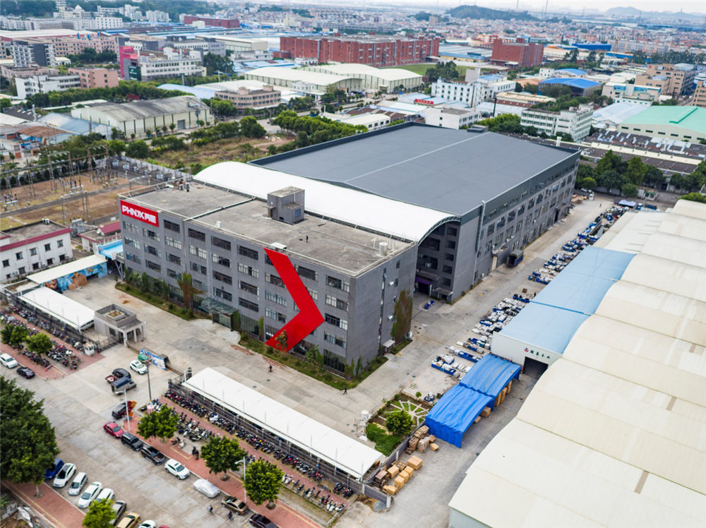
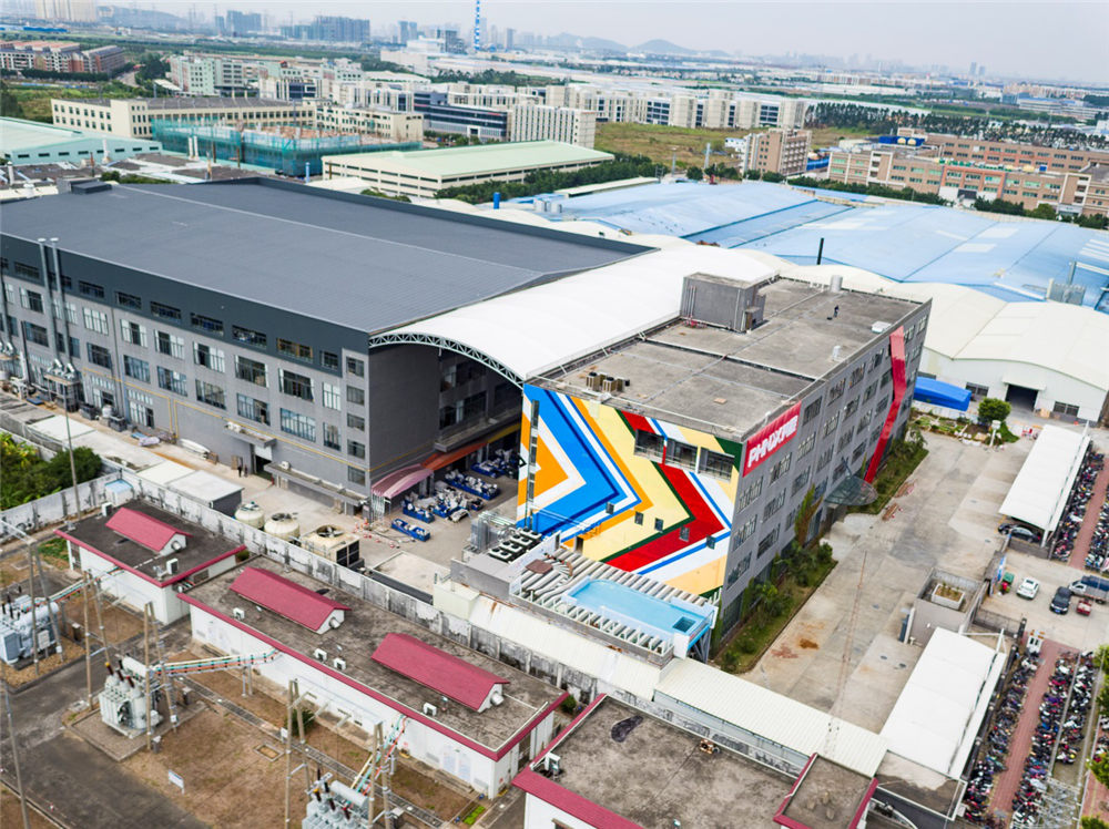
Guangzhou, China, 20th January, 2018- As the first rays of that new dawn in cold winter days begins to warm us and light up PHNIX office building, the sharp and avant-garde new outlook of PHNIX office building catches the attention of everyone who is passing by and even stand on the road to watch.

To coordinate PHNIX enterprise development and catch up with the world trend for visual identification, PHNIX have started to adopt a complete new VI system including the design of PHNIX logotype, brand color system, stationary, promotional items and website since September 2017. The completion of the new office outlook marks a significant step on the upgrading road of PHNIX VI system.

PHNIX VI was used to be recognized as a PHNIX logo with a phoenix image on the left. After an inventive and complete redesign, the logotype are changed to be written in letters of “PHNIX” in a unique font and the logo are designed to be very easy to identify which is the image of the Greater Than Symbols with a gradual varied red background. Now all the publicity materials has adopted this new VI system and the relative office decoration are enduring an overall upgrading.